3.28.2016 ― Metropolitan area of monsters: the He-Man edition
During party hours
Background
Pass midnight downstairs' people are still partying. It is pitch black night and I don't feel like sleeping. While lying on wooden planks I try to play with any ideas how to kill the time, while neighbours party isn't offering enough of entertainment. Then I take my computer and start to search data for something productive. That's when I find Digitransit transportation data [1].
I decide to create some midnight maps with R.
R and maps
Mapping with R is not always the time resistant thing to do. Actually, earlier map libraries contain quite oldish material for mapping. Not just by graphics that are not the most pixel polished versions, but also with the data source of map templates. In case of random cold country from far North, your municipality changes are not actually in the core interest of the makers and their updating process. Therefore, drawing maps with old R packages may result to twisted area compositions.
Just to name few, there are some of packages that can make your mapping easy place to start with:
- library(maps) and library(geosphere) – basic stable maps
- library(leafletR) – interactive maps via browser
- library(RgoogleMaps) – geolocations via API
For trying out loud, basic libraries offer just fine tools to make basic things. Flowing Data tutorial [2] is easily approachable example for visualizing geographic connections. It seems to produce similar technique that was spotted in the famous Facebook map from Paul Butler [3]. As I have also on my hands a collection of public transportation connections, the tutorial has its charm on me. I should visualize the HSL route map same way.
Execution I
There is plenty of data. From bus-stop locations to bus lines and stop times to agencies. The data starts to look so rich with details that I'm getting worried I'll soon find also the 100m running-to-bus records from regular customers. Yet being in the GTFS defined format the data is presented in reasonable state and is doable. For mapping purposes, you need to consider how to cut down the amount of information to produce a relevant results. I wouldn't want to be the route planner: just processing the current data is already admirable; optimizing it would be totally madness!
Public transportation breaths with consumption. It operates more often when people commute between home and work. Buses load sleepy passengers before the rush hour and hasty ones during it. Same pattern reoccurs in the afternoon. For this mapping project, I was interested to check the transportation situation in the morning. Therefore, this will be like the TV series 24: 'the following events happened between 7am and 8am'.
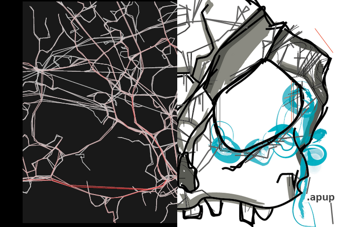
A rocky route map is drawn on a canvas. I'll print all driven routes from within the selected hour. As using pure latitude and longitude points to join sequential stops a path of a vehicle look bullet-straight between any two stops. In reality, the path should be of course adjusted by roads and corners making the connecting line look rather angular shape instead of the Euclidean distance. But for this execution, I make a lazy approach and use plain connections points.
Take me to your leader: good transportation system transports you to centric and relevant locations. Thus popular streets and roads that lead to stations or essential junctions are used more actively. A negative consequence from this are rush hours, when the roads have more users than they can fluently handle. While private road users might try to avoid any road parts that are occupied with other cars, public transportation user would benefit to take a route that has other vehicles accompanying it. This way, it's more convenient to change the vehicle, as the stops would have good transfer potential and short transfer time. In general, stops and stations should overlap and cross each other in practical way to provide smooth transfers for the users.
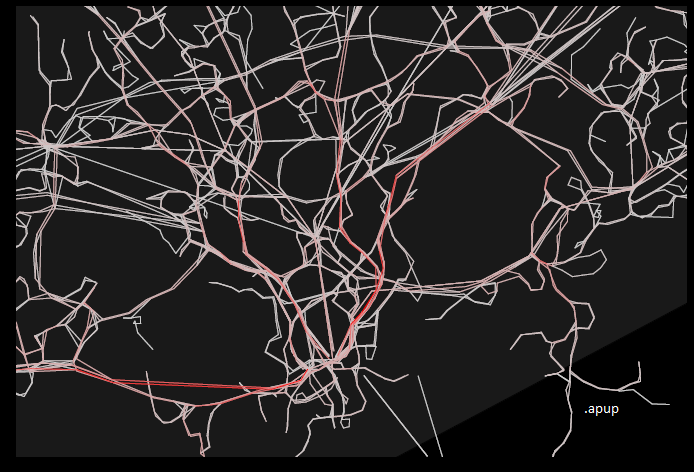
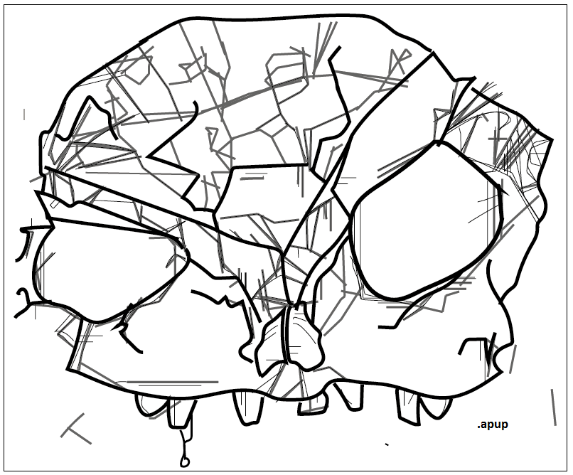
While passengers make the transportation look greener, the colour is an important element here in other perspective. By measuring each route interval occurrence, it's easy to notice which roads have high HSL vehicle presence. To emphasize this popularity, I add scaled red shade for the lines. The stronger the colour, the more used that part of the route is during the hour. The image [4] below is the result version. The map lack all labels, as I wanted to create rather artistic version than reflecting the reality 1:1. Still, you might recognize the main roads that lead to centre. If you is able to differ the map locations, it could be quite useful: changing along red lines on the map, you won't get old while waiting the next vehicle in the morning.
Execution II
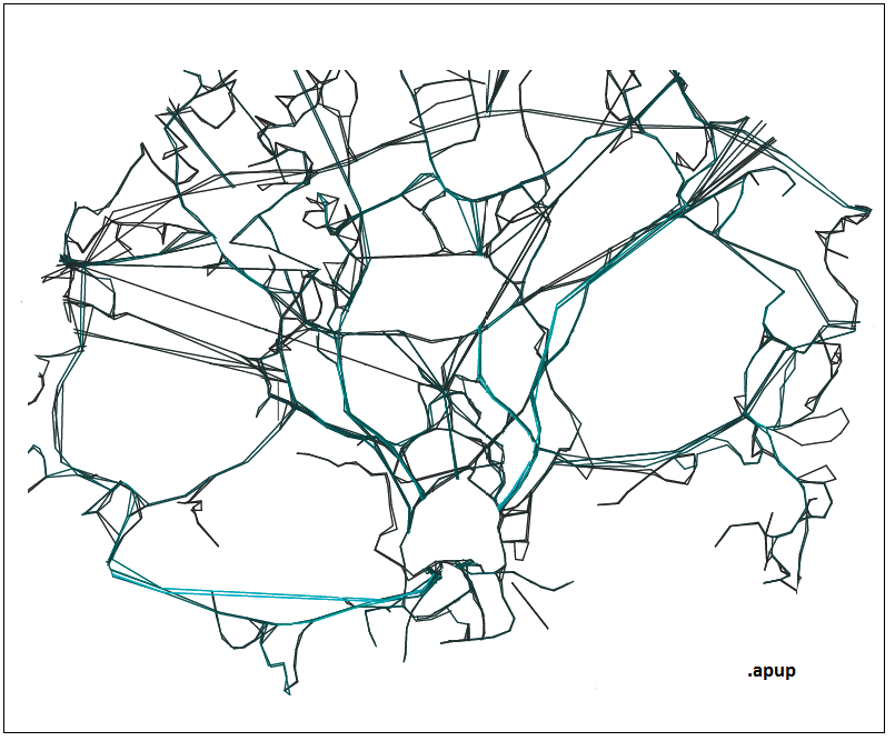
But the thing with the map is...it doesn't look like the Helsinki metropolitan area. To me, it starts to look like those things that crawl to your head when they put you under psychological tests. You know the concept: "What does this [random ink stain] look like to you?". On this dark night of random parties the map and its lines start to resemble more and more...unnatural creatures, monsters and the people I'll meet on the following morning in the same corridor. 'GRRRrrrr' they all will greet me. And so I open Illustrator.
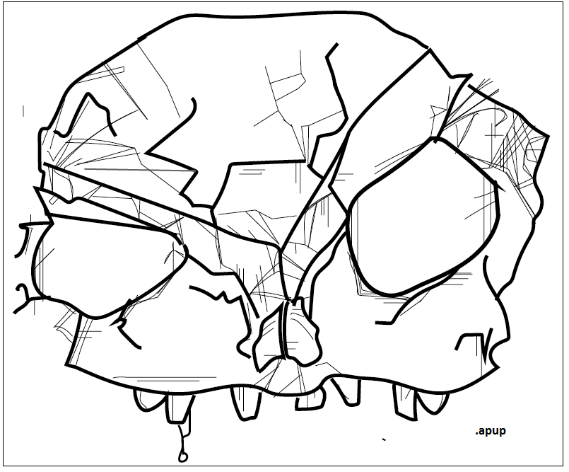
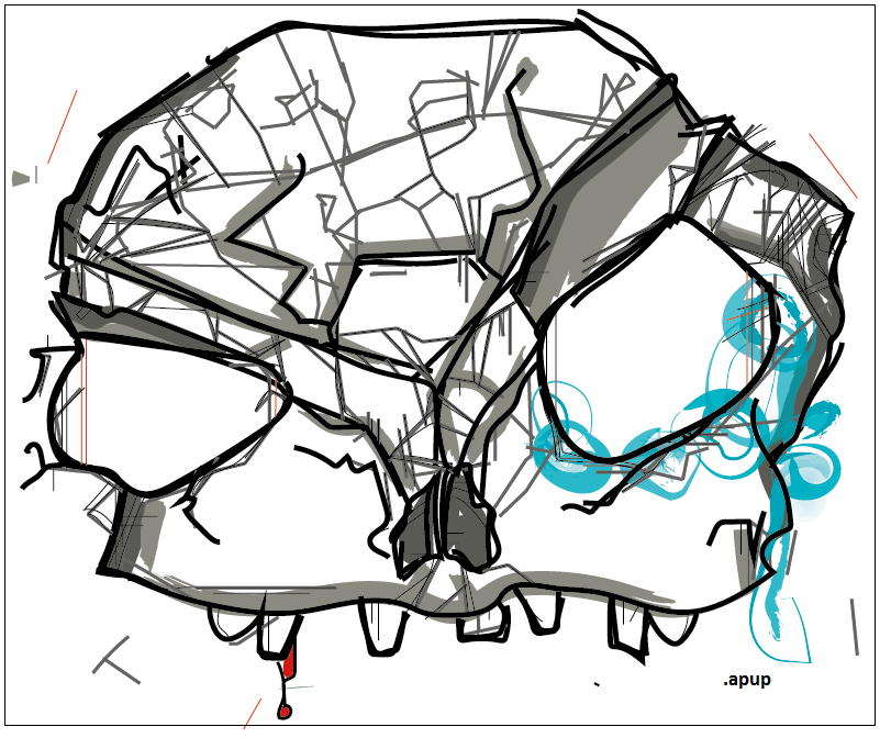
Well, monsters are divided to many sectors: ex-humans (skeletons, zombies, burnt-out office workers), creatures (devils, godzilla, honey puffs monster) and random stuff. But there are just some single features that also can be considered to be quite scary. Such as He-Man's mullet hockey haircut, even him being a mighty hero. This thought is probably what triggers the culmination of the map output to me: what unites metropolitan area and He-Man? They are both in the Skull castle [5].
I mean frankly – look at the formation of the map. Due almost symmetrical limitations by two bays, the round eyes are formed on both east and west side of the centre. Moreover, by taking the arc of the Ring I [5] gives a suggestion for the forehead line and the top of the object: the skull edges already starts to become more visible. As most of the routes are oriented to the centre, long train tracks highlight the imaginary nose bridge, eyebrows and forehead. By erasing some of the connections, strengthening others and taking artistic liberties for the rest – a cracked skull is found. Besides severe head injury, it has a tearful left eye and a bloody tooth too. Such a rustic execution from metropolitan data.
End result
It has been proved now: the Helsinki metropolitan area has a legit doppelgänger.
I wonder why the east side of metropolitan area is so tearful.
Or is there some reason for the west side to look more cheerful?
Party mutes after 2am as local He-Man heroes return their caves.
The public transportation starts to operate more frequently in few hours too.
I hum the lyrics of He-Man by Bondage Fairies [6] and fall in sleep. ∎